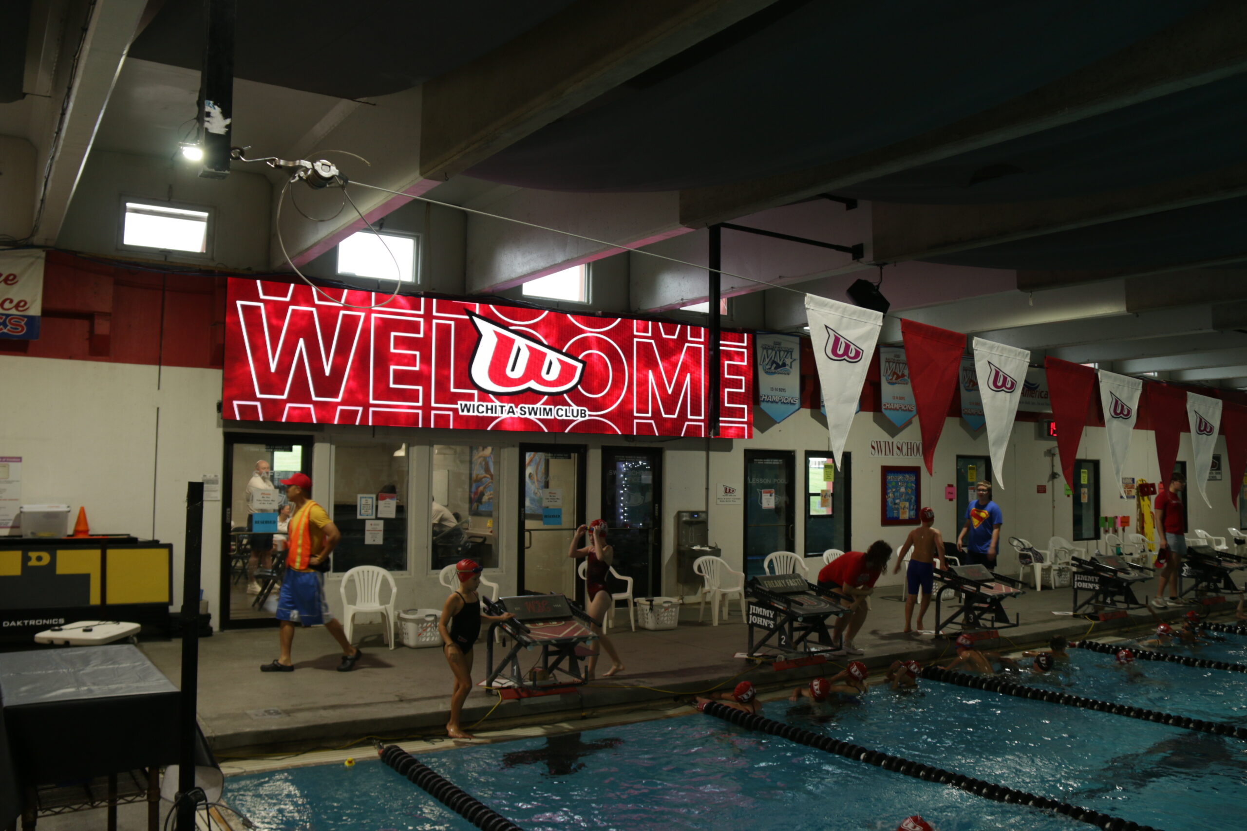
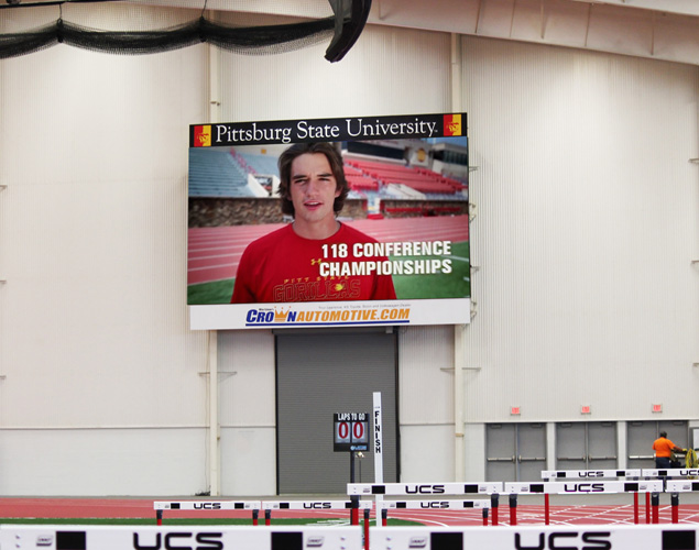
This post explains the simple design decisions that make LED sign messages easier for people to read and understand — even when they’re moving, driving by, or only glancing for a second.
Designing for LED signs isn’t just graphic design at a bigger size. It’s a different mindset.
People don’t stand still and study LED content. They’re walking past it, driving by it, or glancing up while doing something else. That means good LED design isn’t about packing in information—it’s about making a message land quickly, clearly, and without effort.
When you focus on a few fundamentals—distance, hierarchy, contrast, timing, and motion—your content reads better, looks more polished, and actually gets noticed.
Here’s how to think about LED design in a way that works in the real world.
Start With How Far People Will Be From the Sign
Imagine someone driving past at 30 mph. They’re not studying your message like it’s a brochure — they’re trying to read it in motion.
That means:
- Text needs to be big enough to read easily from a distance.
- Thin fonts and tiny spacing just disappear when you’re 50–100 feet away.
- Smaller pixel spacing (pixel pitch) helps letters look smooth and clean rather than jagged.
If you have to squint to read it, other people probably will too.
Leading with the Most Important Info
People don’t read LED signs word by word. They skim.
So instead of trying to fit a paragraph on one screen, think like a friend telling you something quick:
- Say the most important thing first.
- Add one extra detail if you need it.
- Don’t put two different calls to action on one frame — that just makes people stop paying attention.
Treat each screen like a short sentence in a conversation — simple and to the point

Pick Colors That Pop (Without Trying Too Hard)
Some color combos look great on a computer screen … but they get washed out when sunlight is hitting the sign.
Here’s a simple way to think about it:
- Bright text on a dark background usually reads well.
- Dark text on a light background works too.
- Mid-tone colors? They often blur together from far away.
- Use your brand’s colors for emphasis — not for everything. Let the important words be the ones that jump out first.
Keep Words Short and Display Time Long Enough
If someone has only a few seconds to read your sign, long sentences don’t help. They just get lost.
- Think in short phrases, not paragraphs.
- Give each phrase enough time on screen so even slower readers can catch it.
- Two or three clean frames usually work better than one crowded one.
This isn’t just theory — it’s how people actually read things when they’re moving.
Motion Should Help, Not Distract
A little movement can draw your eye to a message — but too much movement just becomes noise.
Use subtle fades or slow slides — think of it like making someone turn their head just a bit, not whiplash.
Quick flashing or wild animation might get attention for a second, but it usually makes the message harder to understand.
Check How Light Affects Your Sign
Places with bright sunlight, big windows, or mixed lighting can make a sign wash out.
On bright days:
- Make sure text stays crisp.
- Don’t rely on pastel or washed-out colors.
- Bold text and punchy contrast help make sure people actually see it.
This is real-world stuff, not theory.
What Real Data Says About Good LED Design
Good design doesn’t just look nice — it gets real results:
- Studies show digital signage can boost sales by about 32%.
- People report that screens can reduce perceived wait times by up to 35%.
- In head-to-head comparisons with static signs, digital often delivers 55–83% higher message recall.
In other words — when your sign is easy to read and well-timed, it actually makes a measurable difference.

Quick LED Design Checklist (Think Like a Human, Not a Robot)
Before you finalize a message, run through this list:
- One clear idea per frame
- High contrast (easy-to-see color pairs)
- Big, heavy fonts with good spacing
- Short copy; no long sentences
- Motion only when it helps focus attention
- Final frame with the action you want them to take
If you read it out loud and it sounds like something someone would say — you’re on the right track.
FAQs About Designing Messages for LED Signs
What is the “3×5 Rule” for digital signage text?
To ensure a message is digestible for mobile audiences, professional designers follow the 3×5 rule: using either three lines of text with five words each, or five lines of text with three words each [Source: Texas A&M Marketing 2025]. This structural constraint ensures the core message is absorbed within a split-second glance without causing viewer fatigue [Source: George & Willy 2026].
How do I calculate the best letter height for long-distance viewing?
A standard engineering benchmark for 2026 is to provide one inch of letter height for every 10 feet of viewing distance [Source: George & Willy 2026]. For example, if your LED sign is positioned to be read from 100 feet away, your primary text must be at least 10 inches tall to guarantee legibility for drivers [Source: LEDCraft Inc. 2025].
What are the 2026 standards for visual color contrast?
Updated accessibility guidelines suggest a minimum contrast ratio of at least 3:1 between text and background for digital displays [Source: Texas A&M Marketing 2025]. High-visibility pairings like Black on Yellow or White on Blue are preferred because they maintain a brightness difference of at least 70%, ensuring the sign remains crisp in direct sunlight [Source: George & Willy 2026].
How does pixel pitch affect my content’s design resolution?
The pixel pitch determines the “Visual Acuity Distance,” where pixels blend into a clear image. The industry “10x Rule” suggests multiplying the pixel pitch in millimeters by 10 to find the ideal viewing distance in feet [Source: SignsandLEDs 2025]. For instance, a 10mm pitch (P10) requires a viewing distance of at least 100 feet to appear as a solid graphic rather than a series of dots.
Contact us at NEXT LED or give us a call at 888-359-9558 for expert advice on your signs.


