Start with the content—and understand what your display can do
If the words on your LED sign look fuzzy, the images seem rough, or the message is harder to read than you expected, you may be wondering whether something is wrong with the display.
Sometimes, the biggest improvement comes from changing the content.
The size of your artwork, the lettering you choose, and the amount of information on the screen all affect how clearly your message comes across. Before you assume you need a different sign, here are a few things worth checking.
Can I make my existing LED sign look sharper?
You can often make your sign easier to read by improving the content you put on it. But there is an important limit: better content cannot add pixels to your display.
Your sign has a fixed number of pixels—the individual points that form the words and pictures. Content designed around that available space generally looks clearer than content squeezed into it.
Think of it this way: a simple message with large lettering gives those pixels one clear job. A detailed photograph, a small logo, and six lines of text ask the same pixels to do much more.
The goal is to make the best use of the display you already have.
Is my artwork the right size for my sign?
Start by checking your display’s pixel dimensions, sometimes called its pixel matrix. You need the width and height in pixels, not just the physical measurements in feet.
If you are unsure of those dimensions, your sign provider or support team can help you find them.
Use those dimensions when setting up content, following your software’s guidance. Artwork created for a website, a printed flyer, or a social media post may have a completely different shape. When it gets resized to fit your sign, lettering can become too small and images may lose detail.
A larger file does not automatically produce a sharper picture. The display still has to fit that image into its available pixels.
Why does my lettering look rough or hard to read?
Small, thin lettering is a common problem. Decorative fonts and scripts can also lose their defining details when displayed with limited pixels.
Try a straightforward font with thicker strokes, enlarge the text, and give each line some breathing room.
If you cannot make the lettering larger without running out of space, shorten the message. Instead of squeezing an entire announcement onto one screen, lead with the information someone needs most.
“Fall Registration Ends Friday” gives a passing reader a clear takeaway. The full registration instructions can live on your website.
Would a simpler design help?
Often, yes. A busy background can compete with the words, even when the text looks large enough on your computer.
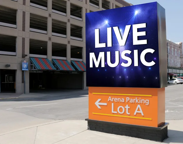
Try placing light lettering against a dark, uncomplicated background—or dark lettering against a light one. Avoid putting essential information over a detailed photograph.
For images, choose one recognizable subject and crop out unnecessary surroundings. A close-up of the product you are promoting will usually communicate more clearly than a wide photograph filled with small details.
These changes do not increase resolution. They make the message easier to recognize.
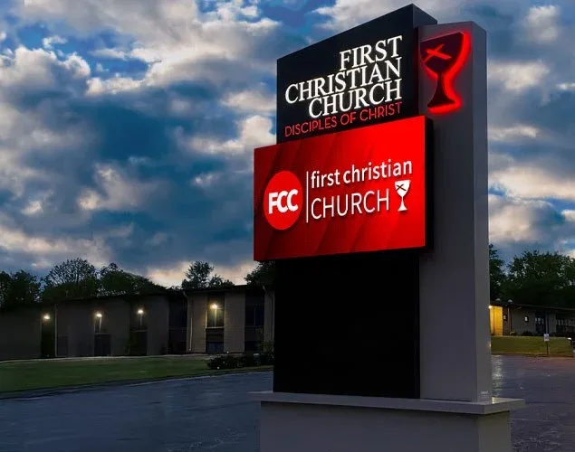
Strong contrast and a simple design help the message stand out on this First Christian Church LED sign.
Why does it look different up close?
An LED sign is meant to be evaluated from the distance where its audience will see it.
Standing directly beneath an outdoor display, you may notice individual pixels and rough-looking letter edges. Step back to the normal viewing distance, and those points can blend into a more complete image.
Check your content from a safe location that represents the audience’s actual view. A design that looks great on your laptop still needs to work on the sign.
When is the display itself the limitation?
If properly prepared content still cannot show the detail you need at your intended viewing distance, the display’s pixel pitch and total pixel count may be limiting factors.
Software cannot turn a lower-resolution display into a higher-resolution one. You can adjust the design to work within its capabilities, but adding finer detail may require different hardware.
Before considering a replacement, try one simple message with large lettering, strong contrast, and correctly sized artwork. View it where your audience would. That gives you a useful starting point for understanding what better content can solve—and where your sign’s limits begin.
Need a Hand With Your LED Sign?
If your NEXT LED sign needs attention, contact our team. Tell us what you’re seeing, and we’ll help you work out the next step.
Better artwork, readable lettering, and simple layouts can help your LED sign look clearer. Learn what you can improve—and why content cannot add pixels to your display.