Choosing the Right Pixel Pitch for Your LED Sign
Pixel pitch made simple: what matters for roadside readability and close-up indoor detail
Determining the right pixel pitch for your LED Sign
Pixel pitch is one of those terms that sounds technical until you connect it to something practical: how close people can be to your display before they start noticing the pixels. In simple terms, pixel pitch is the distance between pixel centers (measured in millimeters). Smaller pixel pitch packs pixels closer together, which looks smoother up close. Larger pixel pitch spreads pixels farther apart, which can still look great when viewers are farther away.
Choosing the right location for your LED sign already did the most important setup: you’ve thought about where the sign will live, how far away the audience will be, and whether they’re moving (outdoor) or stationary (indoor). Pixel pitch is where you turn that real-world viewing situation into a confident display choice—without overbuying resolution you can’t see, or underbuying resolution where it matters.
The easiest way to think about pixel pitch
Pixel pitch is about viewing distance, not bragging rights. A helpful rule of thumb is:
Optimal viewing distance (feet) ≈ 3 × pixel pitch (mm)
Example: 10 mm ≈ ~30 feet
That doesn’t mean a sign “stops working” closer than that. It means that around the optimal distance, the image starts to blend smoothly instead of looking pixelated. Optimal viewing distance is the point where individual pixels begin to blend into a smooth image.
If you prefer a “minimum vs ideal” mindset, a simple framing many buyers understand quickly:
Pitch × 3 = minimum distance (feet)
Pitch × 6 = ideal distance (feet)
The takeaway: the closer people are, the more pixel pitch matters. The farther away they are, the more the pixels blend together and the less benefit you get from going tighter.
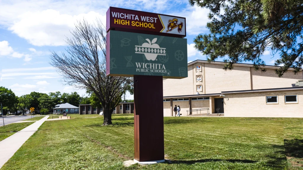
Outdoor Pixel Pitch
Outdoor signs are usually a distance + speed problem. Most people are driving by, not standing still studying a detailed image. That means your pitch choice should support:
The typical viewing distance from the road
A message that can be understood quickly
Clean readability (not “photo realism at 20 feet”)
This is why many manufacturers frame tighter pitches as best for close viewing and larger pitches as more appropriate when the sign is higher off the ground or farther from traffic.
What outdoor buyers often get wrong
Outdoor projects sometimes overspend on tight pitch because it sounds “higher resolution,” even when the audience will rarely be close enough to notice the difference. The smarter approach is:
Start with your typical viewing distance.
Design the message for quick reading.
Select a pitch that looks smooth at that distance.
If you’re placing a sign on a road where people only have a few seconds to read, your sign succeeds because the message is clear—not because the display is capable of ultra-fine detail.
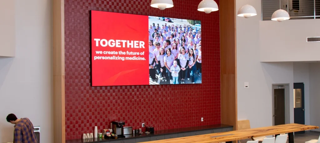
Indoor Pixel Pitch
Indoor displays are a different world because viewers are usually:
Closer
Stationary longer
More likely to notice detail, edges, and “blockiness”
That’s why indoor pitch choices often depend on content type, not just distance. Smaller pitch supports closer viewing and higher perceived detail, which matters more when people are standing near the display.
Indoor pixel pitch is really about what you plan to show
Ask yourself one practical question:
Are you mainly showing text and simple graphics—or do you want photorealistic visuals and video?
If your content is mostly announcements, schedules, and directions, you can often prioritize readability and layout over ultra-fine pitch.
If you want photorealistic imagery, branding visuals, or motion/video, tighter pitch tends to matter more because people can see the detail up close.
Indoor is also where buyers most often regret going too coarse. If the display is placed in a lobby, showroom, or reception area where people stand nearby, the pixel structure becomes part of the experience. In boardroom-style environments, Closer seating can push you toward fine pitch displays.
A practical “start here” guide
Use this as a simple decision filter. It keeps the conversation grounded in what people actually see.
If your viewers are close
Indoor lobbies, waiting areas, counters, showrooms
People will notice edges, detail, and texture
Photo realistic visuals and video are more likely to be part of the plan
A tighter pitch is more likely to pay off here.
If your viewers are mid-range
Indoor open areas or outdoor signs seen from across a parking lot / entrance
Viewers can read clearly, but they’re not studying fine detail
A balanced pitch is usually the goal—clean, readable, not overbuilt.
If your viewers are far
Roadside visibility, signs higher from the ground, or long approaches
- Drivers need short messages they can absorb quickly
A larger pitch can still look excellent at the right distance because pixels blend together as viewing distance increases.
Don’t let pitch distract you from message design
Pixel pitch can’t rescue a cluttered message.
Even with a tight pitch, a sign with too many words, too many lines, or too much movement will still fail at roadside speeds. Pitch is the “clarity foundation,” but message design is what makes the sign readable.
If you keep your outdoor messages short and your indoor layouts clean, pixel pitch becomes a straightforward choice instead of a guessing game.
Frequently Asked Questions: Buying LED Signs
Pixel pitch measures the center-to-center distance between two adjacent pixels, expressed in millimeters. The smaller the number, the more pixels are packed into the same area, which usually means smoother edges and more detail at close viewing distances.
The practical meaning is simple: smaller pixel pitch looks smoother up close because you’re less likely to notice the “pixel structure.”
Start with the question you already framed in your Buyer’s Guide: how far away will people typically be when they view the sign?
A widely used rule of thumb is:
Optimal viewing distance (feet) ≈ 3 × pixel pitch (mm)
Example: a 10mm pitch display is best viewed from about 30 feet away.
That lines up closely with the 1 mm ≈ 1 meter shortcut you’ll see online (because 1 meter is about 3.28 feet). The point isn’t the exact math—it’s the logic: the closer the viewer, the tighter the pitch needs to be to look smooth.
A helpful way to talk about this without getting too technical is:
Minimum readable: you can read the message, but you may still notice pixels.
Comfortable viewing: pixels blend and the image feels smooth.
The biggest difference is viewing distance and viewing behavior:
Indoor displays are often viewed closer, and viewers have more time to notice detail. That’s why fine-pitch indoor video walls are commonly discussed in the sub-3 mm range (0.6–2.5 mm).
Outdoor displays are usually viewed from farther away (and often by moving traffic), so a larger pitch can still look great at the right distance because the pixels blend together as distance increases.
Brightness is also part of the indoor/outdoor conversation, but it’s not really because the LEDs are spaced out. It’s because outdoor signs need far higher brightness to compete with sunlight, and indoor displays typically don’t.
Because you’re buying more pixels (more LEDs and more electronics) per square foot.
Smaller pixel pitch uses more LEDs per square foot, which increases cost.
The buyer-friendly way to frame this (without scaring people) is:
Tight pitch can be worth it when viewers are close enough to notice the smoother detail.
But if your typical viewing distance is far enough that pixels blend anyway, paying for ultra-fine pitch may not add visible benefit.

What's Next?
Now that you understand how pixel pitch connects to viewing distance and content, the next step is simple: match pitch to your real viewing situation, then confirm your message layouts support quick readability.
If you want a second set of eyes on your viewing distance and use case, reach out and share:
- Indoor or outdoor location
- Typical viewing distance (closest and farthest)
- Content type (text only, graphics, photo realistic, video)
Call the experts at NEXT LED Signs at 888-359-9558 and we’ll point you toward a smart starting direction.