Readability and Message Design for LED Digital Signs
Make every message easier to read, faster to understand, and more effective
Start with real viewing conditions
When businesses transition from static to digital LED signs, they often make the mistake of designing content like it’s a printed flyer. This leads to illegible screens that fail to capture attention.
A lot of people treat an LED digital sign like a mini website. That’s where readability starts to fall apart. The truth is simpler: your sign wins when a person can understand the message quickly, without working for it.
Readability and Message Design are the two factors that determine whether a sign is an asset or an eyesore.
This page is about the “structure” behind good messages—font choices, contrast, word count, line breaks, and timing. Content ideas come later. Right now, we’re making sure whatever you post can be read in real life.
Start with real viewing conditions
Before you design a single message, decide what the viewing situation looks like:
How far away will people typically be?
Are they walking, waiting, or driving past?
Do they have seconds, or do they have time?
The United States Sign Council Foundation (USSCF) uses the idea of Viewer Reaction Distance and a Legibility Index to connect viewing distance to letter height. Their standards define the Legibility Index as “distance in feet per inch of capital letter height.”
You don’t need to turn your page into a math problem. You just need to respect this truth: distance drives letter size, and letter size drives readability.

Outdoor message design
Outdoor signs are usually read by people who are moving. That means your message has two enemies: time and speed.
Keep outdoor messages short and “one idea at a time”
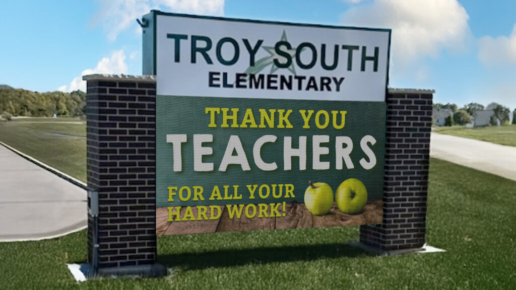
If someone has only a brief window to see your sign, your message can’t be complicated. In practice, outdoor messages work best when each screen shows:
- One main idea
- One simple action (optional)
- No extra detail
Examples that tend to work:
- “OPEN DAILY 9–6”
- “NOW HIRING”
- “SERVICE SPECIAL THIS WEEK”
- “NEXT HOME GAME FRIDAY”
What tends to fail:
- Long sentences
- Multiple offers at once
- Tiny details (dates, terms, long phone numbers)
Use hold time that matches how people actually read
Many sign codes and guidance documents for changeable message signs commonly require messages to stay static for about 8 seconds, with transitions limited (often around 2 seconds max).
Even if your city doesn’t use that exact number, the logic still holds:
- If messages change too fast, people miss them.
- If messages are too busy, people stop trying.
- So the practical outdoor approach is:
- Fewer messages in rotation
- Longer hold times
- Simple, readable layouts zero
Letter height matters more than clever graphics outdoors
USSCF’s legibility work exists for a reason: people can’t read small letters from far away, especially at speed. Their standards and rules-of-thumb documents show how letter height is calculated from viewing distance using a Legibility Index.
You don’t have to publish the math on your page. You can do something more useful:
- Design your outdoor messages as if the viewer only gets one glance.
- Make the primary words large, bold, and high contrast.
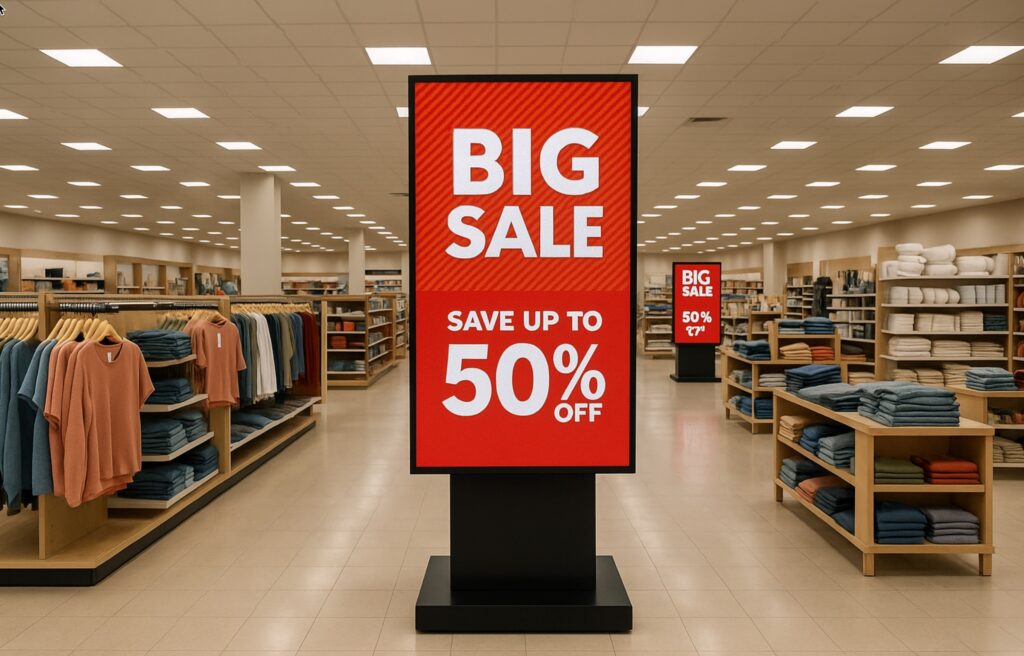
Indoor message design
Indoor displays have two advantages:
- People are closer.
- People often have more time.
That’s why indoor signs can support more detail. But “more detail” doesn’t mean “more clutter.”
Use a simple visual hierarchy
Indoor displays read best when the layout clearly answers:
- What is this?
- What do I need to do next?
A clean hierarchy usually looks like:
- Big headline (the point)
- Smaller supporting detail (the helpful info)
- Optional footer (hours, direction, reminder)
Cornell’s digital signage guidance recommends limiting typefaces and avoiding novelty fonts, because consistency improves legibility
Choose fonts and contrast for quick comprehension
If you want a page-friendly rule to follow, accessibility guidance commonly recommends strong contrast between text and background. One digital accessibility guide also provides a practical rule of thumb for text size: about 1 inch of letter height per 10 feet of viewing distance (and larger for comfort).
You can apply this without turning your sign into a science project:
- If people are close, you can use smaller text—but keep it comfortable.
- If people are across a lobby, increase text size and simplify the layout.
Don’t overload indoor screens with “everything”
Indoor displays can show photo realistic visuals and video. That’s great. It’s also where people get tempted to cram too much on one slide.
A simple rule that keeps indoor content readable:
- If the message requires more than a quick scan, break it into two slides.
- If the slide needs a paragraph, it’s better as a QR code or a handout.
Design choices that improve readability everywhere
These apply to both indoor and outdoor messages.
Keep the layout calm
- Use generous spacing.
- Avoid tight blocks of text.
- Give the eye a clear “start point.”
Limit fonts
One primary font, and a second only if you truly need it.
Use high contrast
Light text on dark background or dark text on light background is usually easiest to read.
Be careful with motion
Motion can attract attention, but it can also destroy readability. On outdoor signs, motion can also trigger code restrictions. Many code examples and compendiums emphasize static displays with limited transitions.
Match message complexity to viewing time
- Outdoor: short, simple, readable fast.
- Indoor: still simple, but you can add structure and visuals.
Quick takeaway
If your sign is hard to read, the fix is almost never “add more.” It’s usually “simplify and enlarge.”
Once your message design is readable, everything else gets easier—pixel pitch decisions make more sense, and your content starts performing the way you hoped it would.
If you want a second set of eyes on your message layout, send one or two sample slides and tell us whether it’s indoor or outdoor, plus your typical viewing distance. We’ll give you practical feedback on readability and layout.
FAQs About LED Sign Message Readability
If someone has to work to read the font, the message is already losing. For LED digital signs, the safest choice is a clean sans-serif font in a medium-to-bold weight—because thin strokes and fancy details break down fast at a distance.
- Use sans-serif fonts (they stay legible on screens).
- Avoid script and keep italics to a minimum (they’re harder to read on digital signs).
- Go medium or bold—but don’t overdo it. When letters get too heavy, shapes can start to fill in visually, especially at night.
- If you’re not sure, do a quick test: step back to your real viewing distance and see if your letter shapes stay crisp.
The short answer: less than you think. If the message can’t be read quickly, people won’t slow down to decode it.
A widely used campus signage guideline is the 3×5 rule:
- 3 lines with 5 words each, or 5 lines with 3 words each, and keep the full message readable in about 7 seconds or less.
- Aim for one clear thought per screen.
- If you can’t read it out loud in a couple seconds, it’s probably too long for drive-by viewing. (This matches the intent behind the 3×5 rule and 7 seconds” guidance.)
- If you need more info, split it into two screens instead of cramming it into one.
Contrast is a bigger deal than pretty colors. Contrast is a key reason messages end up legible or illegible. Plus you have to be careful about effects like color vibration when certain colors fight each other at the edges.
- Use high contrast: light text on a dark background, or dark text on a light background.
- Be careful with bright white backgrounds—some training guidance recommends darker backgrounds because large bright areas can feel harsh and make text harder to read.
- Avoid color pairings that buzz or blur at the edges (that’s the color vibration problem).
- Quick test: turn your design grayscale. If the message still reads clearly, your contrast is doing its job.
Most “bad sign content” comes from trying to do too much at once. The good news is the fixes are usually simple.
- Too much text (people can’t process it fast enough). The 3×5 rule exists for a reason.
- Cluttered layouts (logo, address, phone, offer, and a paragraph all fighting for attention). Keep one primary message per screen.
- Low contrast (pretty colors, but hard to read). Contrast is often the deciding factor for legibility.
- Fonts that don’t hold up (script, decorative, thin strokes).
- Ignoring distance and viewing time. If the audience is moving, your design has to respect that. USSC guidance uses a Legibility Index approach (feet of legibility per inch of letter height) to tie letter height back to viewing distance

Not sure if your message is easy to read in real-world conditions?
Creating content for an LED sign is different than writing for print or a website. Drivers only have a few seconds, and distance changes how your message is seen. The right wording, layout, and pacing all make a difference in whether your message is understood or ignored.
If you’d like help reviewing your message, call 888-359-9558. We can look at what you’re trying to say, how it will be viewed, and help you shape it into something clear, readable, and effective.